Improvements/Wishes for the patcher


#1

Is there a plan to improve the Patcher?

After one day of working with the patcher my eyes hurt. I use a high resolution monitor and the fonts are so terrible small and hard to read It is hard for older people with poor eyesight like me. older_man

A sort of a Zoom funktion or a font changer or something like that would be extremly helpful.


Axoloti TEST release 1.0.10
#2

+1 for scalable/zoomable UI.


#3

Your right ; same issue over here ... +1 for me also ...


#4

the UI has been evolving alot... checkout the demo vs now, if you want to see how much :smile:

when feature X is going to make it into the UI (or any other part of axoloti),

  • is going to be down to how difficult it is
  • how much its wanted
  • how much a developer wants to take it on...

(if you want to get an idea, of how many things were are already looking out , check here https://github.com/axoloti/axoloti/issues ... and this is a subset of requests on the forum)

currently thats down to @johannes (obviously) or I (as a contributor) , if we get more contributors then more things will happen and faster.

scaleable/zoom, the UI code has some parts of this, already in place, but I don't think it would be trivial to change, as there are parts where sizes are hardcoded, but fortunately not that many.
also there is some need of work in this 'layout area', so perhaps it will come with that.


#5

Zoom is definitely on my wishlist. But also not really easy to create neat scalable vector images. Most is painted with vectors, but when lines would end up on non-rounded coordinates, the lines get blurry, or grids become irregular. Needs further study the tradeoffs before implementing. Perhaps scaling at factors that round nicely.

For now I suggest lowering your display resolution temporarily.


#6

@johanes + @thetechnobear

I've had some free time the last hour waiting for a customer, so I looked into the code.

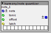
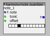
There is an alternative: I played around with the Constant::Font variable. The result was not so bad. The objects are better to read, but on some objects the alignment/spacing fails smile

looks then: <- this size is my heaven on earth.... 14pt.

Not so bad. So it looks that the space computation off the objects are not perfect. But this looks solvable. I think this is what you meant with "hardcodes"

Here a test with several font sizes:

In this case it looks pretty good! This would solve 80% of my wishes smile

So if you like - I would spend some hours to see if I can fix the alignment problems with a little bit hard testing work. Then only a simple configuration parameter "font" must be added to the preferences to replace the font constant.

It's a little bit like in the Arduino IDE smile Theres also a generic font size property which helps a lot...

It's only a simple hack - I think but for people like me, with poor eyes, this could be a simple cheap solution.

It's not the zoom feature, but maybe we can make a menue switch with 3 predefined font sizes. This could work a little bit like a zoom function.


#7

yeah, when this zooming/scaling topic came up I had a quick look at the code.
the main thing I saw was all the components seem to have fixed dimensions, so what Java will do (depending on layout type) if you make the subcomponents (e.g. text labels) bigger, is it will squash them into the available space... which is what you can see going on in your picture with the quantizer
in the const/i example there is enough space left over so it will work. (kind of, in an ugly way)

the other issue, which Im not sure about is, how the wires position is related to the inlet, moving the inlets may (or may not) cause issues.

as you say, we could possibly hack it, but the issue is , it will look horrible, and then everyone will (reasonably) expect it to be fixed properly... so you don't really gain much. (and we don't want different code branches for retina displays, thats just asking for bugs, and hassle!)

personally, and Id prefer to wait till we can make the objects scale properly.
(but I do understand peoples issues)

anyway up to @johannes, I've got more than enough on my plate at the moment :smile:


#8

I think I'll look a little bit deeper into the code. Cause the current patcher is unusable for me. smile Waiting is not my prefered option smile smile smile

And switching down the resolution isn't also no good idea, cause I've to run other applications at the same time which need the high resolution.

Maybe there's a chance playing with the viewport / canvas. Best solution would be to make an abstraction layer to get an independet presentation (mostly called skin (issue #151). But this is far away (sound like JavaFX is knocking on the door). Swing is not good in supporting such things. I'll make some more explorations into the code.

BTW: I could help to make contributions in the patcher. I read the issues list. But most of the GUI issues are marked for "later".


#9

nah #151 is something different... thats all about presentation views like Max/Reaktor...
i.e. if your doing a 'performance' or have finished synth, you really don't want all the wires etc, you just want to see the control (dials etc) in a logical layout ... and that would not be how the patch is built.
so a very different concept... (means having different coordinates, and has to be per parameter and marking which parameters are in the view etc.)

marked save for later, simply means its probably a bit more in-depth due to knock on effects that you might first think, and @johannes thought we had more important things to look at ... its all prioritisation, but if your want to dig in, help yourself... just best to discuss it, as obviously there are lots of ideas about where things are going.

for what its worth (maybe not much) , I think your right that the objects 'scaling' can (to some extent) be separate from everything being scaled. however, I think the whole component has to be scaled (which involves scaling all subcompnets and spacing as well) , not just the text.

the good news is, the objects are all placed on a grid, so (theoretically) if the grid size is increase they will move apart.. so you could do that once your objects are bigger (as they will collide on existing patches)

yeah, as you say, I can imagine on a retina display its pretty small... the objects/text are exactly big on a normal display smile


#10

Hey @hesspet, if you need a quick solution... Most modern operating systems have some kind of zoom function, I've used that in the past when I've needed quick scaling between resolutions, for example in presentations. Just to tide you over if you can't work with the current UI.


#11

@hesspet : The goal is to have identical patch layouts at different scales and operating systems. This is not there, because of the text flow in the objects, but certainly a goal.
Changing the font size does not change the size of the widgets.
The complication is maintaining sharp line art, and regular grids when scaling. If the grid would be, say, 16 pixels, rendered at a scale of 110%, the grid becomes 17.6 pixels, ugly... While if scaled at 125% the grid becomes 10 pixels and will look fine.
For example a checked checkbox widget uses a 1-pixel wide white border between outline and its mark, this should be kept at 1 pixel unless the scaling is large enough to use two (or even more) pixels.
So scaling the UI has a deep impact, and will affect patch layouts when it is done. I'd like to bundle this change with a revision of how parameters (and all of its states like midi mapped, on-parent etc) are visualized and enabling custom layouts of objects.
@thetechnobear I've seen screenshots from macosx with fine retina rendering on macosx. Its rendering at 200% does not introduce coordinate round-off issues.


#12

I'd love a "QWERTY to MIDI" mode (ideally with a keyboard shotcut to toggle it on and off) in the patcher for testing without a controller. The onscreen keyboard is useful but it would be really nice to be able to play notes from the computer keyboard with one hand and use the mouse to tweak parameters with the other.


#13

Sorry I do not plan to develop QWERTY to MIDI, it 'd interfere with keyboard shortcuts, and is difficult to get right because there are many other keyboard layouts than qwerty.
It can be done with Midi-OX in Windows, I guess there are similar utilities on other platforms. Or patched in Pure Data or Max.


#14

What about usb keyboard object? Is it on the list?


#15

USB keyboard on the host port? I'm not sure about the current status. I believe most firmware work is done, but no object is made. Not very hard, but also very low priority for me. Git pull requests are welcome...


#16

Ive just had a look at the code, looks complete to me... as its from the STM lib as part of the HID class with the mouse.

the only thing missing is in ubs_conf.c/h we would need to expose the keyb info.

the primary issue I see, is what would the object look like... as axoloti has little string/character handling, so its would be hard to make it do anything useful, without writing a UI object...
the only thing a simple object could so is output an ascii code.. and then perhaps this shift/ctrl status.
this could allow a user to press a key to do things e.g. trigger different sequences.
that would be pretty straight forward to do.

funny today, I was looking at monome's teletype... now that could be fun... I could use push LED (or later axoloti remote) , and then attach a keyboard... unlikely to happen, but who knows perhaps someone out there fancies a challenge smile


How to access HID functions?
#17

yeah, outlets for modifiers (left and right shift can be separate I believe) and keycode. ascii maybe not terribly useful, not all keys have corresponding ascii, like F1-F12, numlock, scroll lock. The main use case is keytar elektro-punk I guess smile

Generic HID joystick support would be useful, for flight simulator joysticks, racing wheels, or SpaceNavigator.


#18
  • Larger " Open Recent" (more then the 8 entries)?
  • Drag n' drop *.axp to a new patcher window?
  • Double click to open *.axp?

#19

favorites section in top menu bar would be nice.
Nord modular patcher was quite a mess so i dont want to ever go that way - however it would be nice to have some sort of macros or something. Although it isn't that much of a problem - the current "type to find" approach is very nice.


#20

After playing with it a while, here's a couple improvements top on my list I'd love to see sooner than later:

  • Custom arrangement or grouping of knobs for the 'parent controls' on sub patches.

  • The ability to attenuate the min/max value of the knobs by typing in custom min/max values. (For instance -20/+10 as opposed to -64 / +64 default) micro tuning some of the parameters are key to making really interesting patches. Especially percussion style sounds.