WIP (HERON) Axoloti Addon Board Project


#21

one more thought, bear in mind you can get most encoder models with a built in switch, so you might not actually want an extra button beneath every single encoder? in general i don't see the use case for a direct conncetion/linear mapping between encoder and button? other than a main "data entry"/"preset" encoder maybe

also i am a bit confused as to why the position of the axo board would matter? won't it be underneath the frontplate, within an enclosure? you should easily be able to put buttons and encoder to whereever you hide the axo board in the back?

i think rgb leds do make a lot of sene in a step sequencer, you could easily indicate different trigger types/samples/velocities etc. or switch colour between banks etc.

another option would be to use illumated pushbuttons instead of button+led, saves you some frontplate real estate.


#22

I think the Idea with the buttons was to swtich between different layers of control.

i really welcome this! bear in mind that with encoders you need some kind of visual feedback to see where the value is. propably that would be the display on the right. as you maybe wanna display 4 values that could be a bit bigger?

One thing to consider with display is also that they should stay readable when you're on the controls.


#23

or maybeeeee if there was some kind of magical colourful LED ring around the encoders to indicate the values wink wink


#24

Yeah as blindsmith said it's for switching the layers of controls

A single pcb is my prefered option over having to seperatly mount and solder the encoders in the face plate.

Illuminated push buttons got nixed as they add about $15 to the cost vs seperate buttons and led's + anouther $20 for button caps that are designed to illuminated i'm trying to keep the cost as low as possible if people want to build at home and for my student budget (right now it's sitting at around $35aud (21 euros)) If there's enough intrest i might consider a varient with illuminated buttons since the electronics would be pretty much the same.

I've seen your project previously and think it looks fantastic would have bought some if the Australian dollar didn't fare so badly against the euro. As for as somthing simlar for this that would be cool but is going to limit it's diy ability and push the cost up substatually.

Bi colour at least seem worthwile for that but i do also really like the nice rectangle led's i'm using there and haven't seem any in that style that are multi colour will mull on this further


#25

Haha yes that is definately the most beautiful and musical solution :wink: But for a first time electronics project maybe too much thats why I didnt suggest it...

#26

Nice project Tim052. Maybe too early for this question... Any ideas on how much it can cost? Will it be a DIY kit or a whole product?


#27

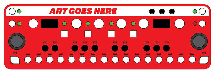
So i've had some time to do a second pass on that layout the first pass was oviouly a bit of mess and was mostly derived from where i found space on the pcb in order to be able to fit everything in with minimal dead space i've decrated the height of the device and widened it to around 31cm which should make the buttons a lot more comfortable to use and of course added the 16th step and some +-/modifier buttons on either side of the step sequencer.

Current concerns i have with this layout are the bank buttons not clearly indicating that they are linked to bank selection rather than the values of 4 main encoders but having them where they are is a much more effiecnt use of space so that might be a necessary compromise that can be ajusted for by labeling he front plate.

Brave people who are willing to get pcbs made and source the components themselves should be able to do it pretty cheap as far as me selling things i have some ideas regarding cases/faceplates and kits as i have acess to some cnc tools but i don't want to get ahead of of myself till i have somthing thats that has all the basic features working.


#28

Also keep in mind that there might soon be a more powerful Axoloti board around, created by @urklang, which is probably going to be the future of Axoloti.

An the box looks really good now, by the way.


#29

This looks awesome, I would love to get this when it becomes available. I did not read through the entire thread but it looks really cool man.


#30

That's looking way better, Tim, and I like that it has some symmetry to it now, looks a heck of a lot more tidy. Being the stubbornly honest chap I am though, I'm still gonna pick out two personal dislikes about it.

The first thing that stands out as odd is the offset position of the buttons under the knobs. To fix that, I would put the buttons directly beneath the knobs, and instead, put the indicators to the side of the buttons rather than offsett the buttons themselves. This would make it look less odd or skewed, this is because the positions of the buttons and knobs are more noticable than the positions of indicators.

The other thing that stands out as odd is the shape of those bottom corner buttons (yuck). I understand why you did that due to the shape of the case, but to be honest I preferred the hard corners of the original case over the rounded ones of the new one. One other thing to bear in mind is manufacture, cause I'm guessing it will be more difficult and expensive to manufacture the round-cornered case anyway.

That said, I'm just being brutally honest with you; design is my thing and I don't believe in blowing smoke up anyone's backside when they ask for opinions on something regards design. So, other than the two things I just pointed out, I think it's very nice!


#31

Actually, I'd like to add a third dislike about that design. It has to do with the graphic strip you've placed along the top because it creates two problems that would not otherwise even exist.

The first problem it creates is that is makes the unit look smaller than it is. The second problem it creates is that it's driving you to waste panel space at the top. If it were not for that strip, there would be no need to offset buttons or indicators in order to keep it looking tidy.

So the strip doesn't work, it creates two problems and basically, solves nothing. I also think the unit would look better without the strip anyway.


#32

I think the strip is there because the midi and USB ports need more clearance than the rest of the components, so this has to be done to keep the whole unit from being too thick.


#33

To be honest I never imagined it being that small. Why does just about everyone lately seem to have this obsession with things being so small?

When it comes to physical interaction, small is no good, small is bad ergonomics, small is a PITA, and small will always be outclassed by big (as no doubt KORG are learning the hard way right now with Behringer on the scene with their full-sized key Odyssey for a fraction of the price of the utterly pointless down-sized KORG).

I'm guessing Roland are another brand who will never learn :roll_eyes:

I get that people like portable, but does it have to be so thin that the layout is physically effected by it?

The same problem is true with modern cameras, they're nowhere near as nice to use as the older stuff, and mainly it is down to poor ergonomics cause they're too small. I could go on, but don't worry, I won't.


#34

This is shaping up v nicely. I will be picking up a second axoloti when urklangs new H7 based board comes out, think I might have to pair it with a heron control board when you're done :slight_smile:


#35

I had come here looking at how to mux digital signals for the reason of designing a control surface very similar (in my head) to this.
I hope you decide to continue to pursue this.
Whether or not you do continue with it, the link in the first post to the schematic is now dead: Could you (or another helpful board member) repost it, please?


#36

Hi this is still very much still in progress the project has changed quite a bit and now handles the muxing using io expanders over i2c connected with an esp32 which handles demuxing and bunch of other things. It's now more of a midi sequencer with proper screen support and a nice ui etc closely designed to work with both the current Axoloti and the new Asko board. We should have some more concrete hardware to share early next year. At a certain point everyone weighing in on each change is not that helpful in guiding the design in a focused path.